Corporate Presentation Design
This page showcases a selection of corporate presentations we designed for the experience team at Jedco over the past three years.
Since these decks were presented to senior management, the messaging and narrative had to be precise, concise, and easy to follow.
They initially hired our agency for a single project. Since then, we have continued designing many of their corporate presentations.
In this case study, we break down selected presentations and the approach we used to transform rough internal thinking into custom, presentation-ready narratives.

The slides contain modified content to protect clients’ confidential information.
From Rough Notes to a Cohesive Corporate Presentation Story
Defining What the Audience Expected from the Presentations
Before working on the content, we asked the client what their audience expected from the decks. Their answer was clear: the audience wanted visionary ideas presented quickly, without long explanations or overloaded slides.
That became the foundation for how we structured the narrative and messaging.
Turning Rough Internal Notes into Cohesive Corporate Presentations
The client shared rough Word documents containing fragmented ideas, internal notes, and early-stage thinking. We refined and restructured that content into streamlined messaging that communicated long-term vision with clarity.
The presentations covered themes like passenger experience, sustainability, and PRM strategies, so the narrative needed to feel future-focused while still grounded in practical strategy. We simplified complex ideas, removed unnecessary detail, and created a cohesive flow across the presentations.

The slides contain modified content to protect clients’ confidential information.

The slides contain modified content to protect clients’ confidential information.
Shaping the Deck's Visual Tone
Creating Custom Illustrations and Icons
Once the content was finalized, we moved into the design phase of the corporate presentations. Before designing the slides, we created a set of custom illustrations and icons specifically for this project.
We wanted the visuals to feel relevant to the airport industry instead of relying on generic stock assets.
Designing Visuals for Specific Concepts
Some ideas in the presentations were too specific to communicate using standard icons. Concepts like flight delays and passenger movement required custom visuals to make them immediately understandable.
So, we designed dedicated illustrations that simplified those concepts and made the slides easier to follow.


Making the Abstract Understandable Across the Corporate Presentation Design
In the client's rough notes, we found a few concepts that couldn’t be explained with words alone. So, we translated those ideas into infographics while wireframing the content. You can see these visual digrams laid out across the two slides shown here.


Designing Corporate Presentations Around Concept and Psychology
For these projects we worked closely with the Experience Supervisor at Jedco. From day one they made it clear that they wanted us to have full creative freedom, without being restricted by brand guidelines. That gave us room to design each deck with its own color theme based on the concept and the psychology behind it.
Clean. Efficient. Forward-looking.
This deck was designed to feel the way a modern airport experience should feel. We used a blue-and-purple color system to balance trust and innovation, while the minimal layouts and structured infographics helped simplify complex operational ideas.
Instead of relying on generic corporate visuals, we used custom aviation-inspired graphics to make the presentation feel directly connected to the airport environment and the passenger journey itself.


The slides contain modified content to protect clients’ confidential information.
Bold. Environmental. Optimistic.
This deck was designed around the idea of sustainability in passenger experience. We used a green-focused visual system to immediately connect the presentation to environmental thinking, while gradients, organic shapes, and nature-inspired imagery helped the deck feel more human and less corporate.
The layouts were kept clean and structured so complex sustainability initiatives, benchmarks, and implementation models could be understood quickly without overwhelming the audience.


The slides contain modified content to protect clients’ confidential information.
Energetic. Commercial. Fast-moving.
This deck was built around revenue growth and non-aeronautical strategy, so the visual direction needed to feel more dynamic and commercially driven than the other presentations. We used bold purple and orange gradients to create a sense of momentum and ambition, while sharp geometric elements helped reinforce ideas around profitability, efficiency, and strategic growth.
The layouts were intentionally modular and presentation-heavy to keep the deck visually engaging even when discussing operational frameworks, benchmarks, and revenue models.


The slides contain modified content to protect clients’ confidential information.
Calm. Human. Intentional.
This deck was designed around accessibility and disability inclusion, so the visual direction needed to feel empathetic rather than overly corporate. We used soft neutral tones, generous spacing, and minimal layouts to create a quieter and more thoughtful presentation style.
Black-and-white photography was paired with subtle beige accents to keep the focus on people, experiences, and accessibility challenges without distracting from the message itself.


The slides contain modified content to protect clients’ confidential information.
Strategic. Structured. Audience-driven.
This deck was designed around brand positioning and communication strategy, so the visual direction needed to feel clear, organized, and presentation-focused.
We used a purple-led color system to create a balance between professionalism and creativity, while the clean layouts and modular content blocks helped simplify frameworks, audience segments, and brand touchpoints. The overall design was intentionally restrained so the strategy itself remained the center of attention.


The slides contain modified content to protect clients’ confidential information.
Approachable. Organized. Service-focused.
This deck was designed around PRM service providers and accessibility support systems, so the visual direction needed to feel professional without becoming cold or clinical.
We used soft pink tones combined with structured navy elements to create a balance between empathy and operational credibility. The layouts were kept clean and modular to help present multiple service providers, processes, and client systems in a way that felt easy to navigate and visually consistent.
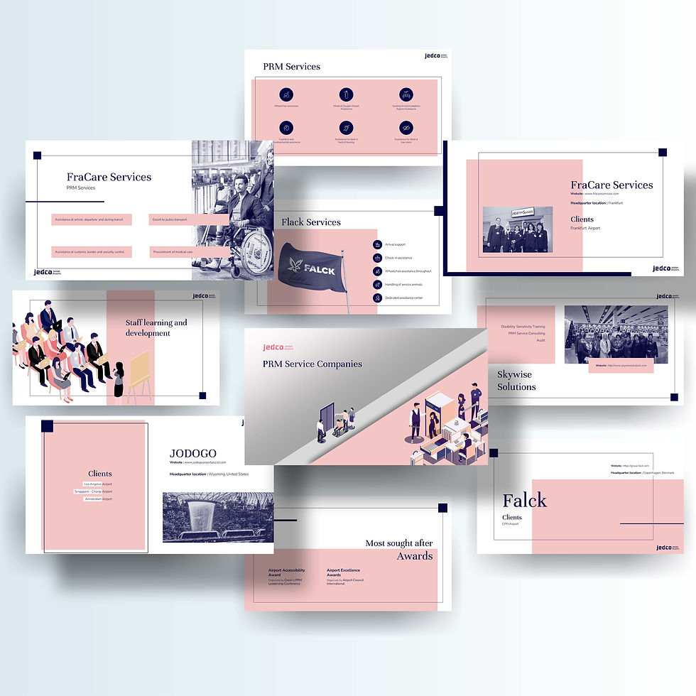


The slides contain modified content to protect clients’ confidential information.
An Ongoing Partnership Built on Consistent Results
The client has continued working with our agency since the first project, and we still design many of their presentations on an ongoing basis.