
How to Build a Timeline Slide for any Presentation
- Ink Narrates | The Presentation Design Agency

- May 1, 2025
- 10 min read
Updated: Mar 17
John had one firm instruction when we were working on his investor pitch deck:
"The timeline slide is critical in my pitch deck, and I want it to look nothing like those templates you find online. They're clunky, outdated, and honestly embarrassing to show serious investors."
He wasn't asking for much. He just refused to settle for ugly.
As a presentation design agency, we've seen this problem show up in nearly every deck we review: the timeline slide is almost always the weakest link, not because the content is bad, but because the design is borrowed from a template that was never worth using in the first place.
So, in this blog, we'll show you exactly how to design a timeline slide that looks sharp, feels intentional, and holds its own in any high-stakes presentation, whether you're pitching investors, presenting a roadmap, or walking a client through a project plan.
In case you didn't know, we specialize in only one thing: making presentations. We can help you by designing your slides and writing your content too.
First, Let's Look at an Example of a Timeline Slide from Our Work
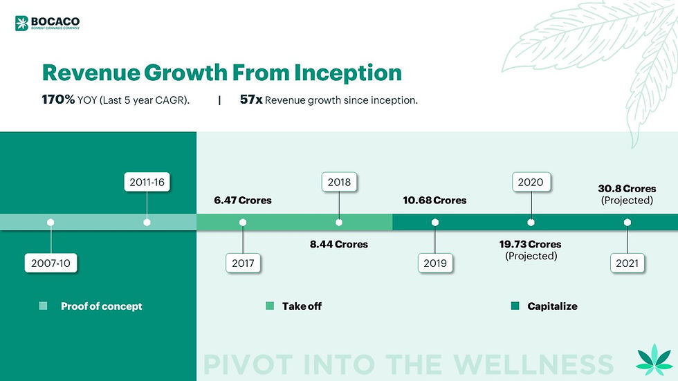
The slide above is from a Series B investor pitch deck we designed for Bocaco. Notice what's happening here: the timeline isn't just a line with dots. It uses a three-phase color system, "Proof of Concept," "Take Off," and "Capitalize," to tell a growth story visually.
The revenue numbers are placed with intention, alternating above and below the line so nothing feels cramped.
The background color shift reinforces the phase transitions without a single word doing that job. It's clean, it's branded, and most importantly, it respects the intelligence of the investors sitting across the table.
If you want to go deeper on how we built this deck, the full case study is right here: BOCACO
How to Design a Timeline Slide Using the C.L.E.A.R. Framework
Most people approach a timeline slide the same way they approach packing a suitcase the night before a flight. They throw everything in, hope it fits, and deal with the mess later. The result is a slide stuffed with dates, arrows, and text boxes that no one in the room actually reads.
We've designed enough decks to know that a great timeline slide doesn't happen by accident. It happens because someone made a series of smart, intentional decisions before opening PowerPoint or Figma. So we built a framework for it.
We call it the C.L.E.A.R. Framework. It stands for Context, Layout, Emphasis, Alignment, and Refinement. Walk through each step in order, and you'll have a timeline slide that doesn't just look good. It communicates.
C: Context. Know What Story Your Timeline Is Actually Telling.
Here's the thing most people skip entirely. Before you touch a single design element, you need to ask yourself one question: what is this timeline supposed to make my audience feel or understand?
A timeline slide in an investor pitch deck is telling a growth story. A timeline in a project proposal is building confidence in your process. A timeline in a company history slide is establishing credibility.
These are three completely different emotional jobs, and they require three completely different design approaches.
Take John's situation. He was building an investor pitch deck and his timeline needed to show momentum. It needed to make the arc of his business feel inevitable to the investors sitting across the table. That one goal changed everything from the number of milestones we included to how we weighted the data on the slide.
So before anything else, write down one sentence that completes this: "After seeing this slide, I want my audience to think..." That sentence is your design brief for the entire slide.
L: Layout. Choose a Structure That Serves Your Content.
Once you know your story, you need to pick the right layout. And no, a horizontal line with dots is not your only option. Here are the three layouts we use most often depending on the context:
The Linear Horizontal Timeline works best when you have a clear chronological progression and want to show forward momentum. It reads naturally left to right, which mirrors how we process time. This is the right choice for growth stories, product roadmaps, and company histories.
The Vertical Timeline works better when each milestone needs more descriptive text. Stacking events vertically gives each one more breathing room and makes the slide easier to read on screens where horizontal space is limited. This is a strong choice for process-heavy or phase-based presentations.
The Phase-Based Timeline is what we used for Bocaco, a cannabis company whose Series B pitch deck we designed. Instead of treating every milestone equally, we grouped them into phases with distinct visual treatment, "Proof of Concept," "Take Off," and "Capitalize." This approach is the most powerful layout for investor decks because it shows not just what happened, but how the business evolved in distinct chapters.
The layout you choose should feel like it was made for your content, not the other way around. A common mistake is forcing a horizontal layout onto a milestone-heavy timeline and ending up with text so small it's unreadable. If your content doesn't fit cleanly, change the layout before you change the font size.
E: Emphasis. Not Everything Deserves Equal Weight.
This is where most DIY timeline slides fall apart. Every milestone gets the same size box, the same font weight, the same visual treatment. The result is a slide that looks democratic but communicates nothing.
In any timeline, there are two or three moments that matter more than the rest. Your funding round. Your product launch. The year revenue crossed a threshold. Those moments deserve to stand out visually. Everything else is supporting context.
You can create emphasis through size, by making key milestones larger. Through color, by using your brand's primary color for critical points and a neutral for the rest. Through typography, by using bold or a larger font size for the dates or figures that matter most. Or through position, by elevating a milestone above the line to signal its importance.
In the Bocaco slide, the projected revenue figure for 2021 sits in bold, heavy type because that's the number investors are leaning forward to see. Everything else is sized and styled to support that moment, not compete with it. When you're designing your own timeline slide, identify your version of that number and build the visual hierarchy around it.
A: Alignment. Visual Consistency Is What Makes a Slide Look Professional.
You can have a great layout and strong emphasis, and still have a timeline slide that looks slightly off. Nine times out of ten, that's an alignment problem.
Every element on your timeline should sit on an invisible grid. Dates should align consistently, either always above or always below the line, unless you're intentionally alternating for spacing reasons as we did with Bocaco. Labels should start from the same baseline. Icons, if you use them, should be the same size and sit at the same height.
Alignment is the difference between a slide that looks designed and a slide that looks assembled. Audiences can't always articulate why a slide looks unprofessional, but misaligned elements are almost always the culprit.
One practical tip: turn on your gridlines and snap-to-grid in whatever tool you're using. It sounds basic, but it forces discipline into your layout and saves you from the subtle misalignments that are invisible until you put the deck on a projector.
R: Refinement. Edit Until Nothing Can Be Removed.
The last step is the one most people skip because they're tired and the deadline is close. But refinement is where a good timeline slide becomes a great one.
Go back through your slide and ask: does every element earn its place? Does every date need to be there, or are some just filling space? Does every label add information, or is some of it already obvious from context? Is there any visual noise, a border, a shadow, a gradient, that's adding complexity without adding clarity?
The best timeline slides are ruthlessly edited. They include exactly what's needed and nothing more. White space is not wasted space. It's breathing room that makes the important stuff easier to absorb.
A good test: send your slide to someone who doesn't know your business and ask them what the main takeaway is. If they can tell you in one sentence, your refinement is working. If they can't, something is fighting for attention that shouldn't be.
The C.L.E.A.R. Framework for Quick Reference
Step | What It Means | Key Question to Ask |
C - Context | Define the story your timeline tells | What should my audience feel after seeing this? |
L - Layout | Choose the right structural format | Does this layout serve my content or fight it? |
E - Emphasis | Give visual weight to what matters most | Which 2-3 milestones need to stand out? |
A - Alignment | Keep every element on a consistent grid | Does this look designed or just assembled? |
R - Refinement | Edit until nothing can be removed | Does every element earn its place? |
The Biggest Timeline Slide Mistakes That Make Your Deck Look Cheap
Getting the framework right is half the battle. The other half is knowing what to actively avoid.
You're Using the Default Template and Calling It a Day
PowerPoint and Google Slides ship with timeline templates because they need to ship with something. That doesn't mean those templates are good. They're designed to be acceptable to everyone, which means they're remarkable to no one.
The moment an investor or client recognizes a default template, the slide loses credibility. It signals that the presenter ran out of time, or worse, ran out of care. Your timeline slide should look like it was built for your story, not borrowed from a software library.
You're Putting Too Many Milestones on One Slide
More information does not equal more convincing. A timeline slide crammed with twelve milestones, each with a three-line description, is not thorough. It's exhausting. Your audience's attention is a limited resource, and a cluttered timeline burns through it fast.
Pick the five to seven milestones that genuinely move your story forward and cut the rest without guilt. If certain details feel too important to remove, build a backup slide for the appendix. The main timeline slide should breathe.
Your Typography Is Doing Too Much
Three different font sizes, two font families, bold here, italic there, all caps somewhere else. We see this constantly. Typography on a timeline slide should have one job: make the hierarchy obvious at a glance.
Pick one font family, use two weights at most, and let size do the heavy lifting. Everything else is noise.
You're Ignoring Color as a Communication Tool
Color on a timeline slide isn't decoration. It's information. If every milestone is the same color, you're leaving one of your most powerful design tools completely unused.
Use color to signal phases, to flag completed versus projected milestones, or to draw the eye to the moment that matters most. Used with intention, color can tell half your story before a word is read.
How to Present a Timeline Slide Without Losing Your Audience
Don't Read the Slide. Narrate It.
The moment you start reading dates and milestones out loud in sequence, you've lost the room. Your audience can read. What they can't do is understand the significance of what they're reading without your help.
Your job as a presenter is to be the narrator, not the reader. Instead of saying "in 2017 we hit 6 crores, in 2018 we hit 8 crores," say "this is the moment the business stopped being an experiment and started being a company." Give the numbers meaning. That's what a presenter is for.
Lead With the Conclusion, Not the Beginning
Most presenters start at the left side of the timeline and walk chronologically to the right. It feels logical. It's actually backwards. Your audience doesn't know why they should care yet. Start by telling them where the story ends, or where it's going, and then walk them back through how you got there.
"We're projecting 30 crores by next year. Here's the journey that makes us confident in that number." Now every milestone on the slide carries weight because the audience already knows the payoff.
Pause at the Moments That Matter
Not every milestone deserves equal airtime in your presentation, just as not every milestone deserves equal visual weight on the slide. Identify the one or two inflection points in your timeline, the moments where everything changed, and slow down there. Let the significance land.
Silence in a presentation is not awkward. It's emphasis. The moments you pause on are the moments your audience remembers.
Treat the Timeline Slide as a Trust-Building Tool
This is the big picture thinking most presenters miss entirely. A timeline slide isn't just a history lesson. It's evidence. Every milestone you've hit is proof that you do what you say you're going to do.
Every phase you've moved through is proof that the business is real and growing. When you present a timeline slide with that mindset, your entire delivery changes. You're not recapping the past. You're building the case for the future.
Timeline Slide FAQs: What Our Clients Ask Us During Projects
How many milestones should a timeline slide have?
There's no universal number, but we've found that five to seven milestones is the sweet spot for most presentations. Fewer than five and the slide can feel thin, like you haven't done much. More than seven and you start competing with yourself for attention.
The real question isn't how many milestones you have. It's how many milestones genuinely move your story forward. If a milestone doesn't change how your audience thinks about you or your business, it probably doesn't belong on the slide.
Should a timeline slide show future milestones or only past ones?
Both, and that's actually one of the most powerful things a timeline slide can do. Showing where you've been builds credibility. Showing where you're going builds excitement.
The key is to make the visual distinction between completed and projected milestones very clear, through color, opacity, or labeling, so your audience always knows what's real and what's a target. Blurring that line, intentionally or accidentally, is a fast way to lose trust in a room full of investors.
What's the right amount of text?
As little as possible. A timeline slide is a visual communication tool, not a written report. Each milestone should have a date, a short label of two to four words at most, and if necessary, one supporting data point. If you find yourself writing full sentences on a timeline slide, that's a sign the content belongs in your speaker notes or in a separate supporting slide, not on the timeline itself.
Can this slide work for something other than a company history or investor deck?
Absolutely, and it's actually underused in contexts beyond pitch decks. A timeline slide works extremely well in project proposals to show your delivery process, in client onboarding presentations to set expectations, in case study decks to walk through how you solved a problem, and in internal strategy presentations to show a product roadmap. The underlying principle is the same regardless of context: you're showing a sequence of events in a way that builds understanding and confidence.
Why Hire Us to Build your Presentation?
If you're reading this, you're probably working on a presentation right now. You could do it all yourself. But the reality is - that’s not going to give you the high-impact presentation you need. It’s a lot of guesswork, a lot of trial and error. And at the end of the day, you’ll be left with a presentation that’s “good enough,” not one that gets results. On the other hand, we’ve spent years crafting thousands of presentations, mastering both storytelling and design. Let us handle this for you, so you can focus on what you do best.

How To Get Started?
If you want to hire us for your presentation design project, the process is extremely easy.
Just click on the "Start a Project" button on our website, calculate the price, make payment, and we'll take it from there.