
Duolingo Inspired Pitch Deck Design for an E-learning Startup
- Ink Narrates | The Presentation Design Agency

- Nov 2, 2025
- 4 min read
When we were building a pitch deck for Mo, an e-learning startup founder, he came to us with a very specific idea.
He said:
“I’ve been going through pitch decks online and I saw the Duolingo pitch deck. It’s fun. The mascot. The vibe. It doesn’t feel like a boring corporate presentation. Can you make mine like that? I don’t want it to be too serious.”
Fair ask. But here’s the problem. Copying someone else’s tone is the fastest way to dilute your own.
Our Creative Director smiled and said, “We can absolutely make it playful. But instead of copying Duolingo, let’s build something that actually fits your brand. Same energy. Better storytelling. More intentional design.”
In this blog, we’ll break down the pitch deck we built for Mo and the thinking behind every decision.

Ink Narrates is a pitch deck design agency.
To date, our work has helped startups & companies raise over $250Mn in funding.

By the way, this is the Duolingo pitch deck Mo was talking about…
As you can see, it’s playful, illustration-heavy, and a clear departure from the usual “corporate template” decks.
The Duolingo Style Pitch Deck We Designed for Mo
Mo initially wanted a deck almost identical to the Duolingo style, but we knew that would become a liability over time, so we advised building a custom deck instead.

While the reference made sense, replicating it would have created a mismatch.
Duolingo’s style works because it is deeply tied to its brand identity. For an early-stage startup, copying that tone can reduce clarity and long-term credibility.
We knew that if we followed the reference too closely, the deck might feel trendy in the short term but limiting as the company evolved. So, we advised a different approach: retain the sense of playfulness, but build a custom design system aligned with Mo’s brand and business narrative.

We started by restructuring the content.
Instead of designing around heavy text, we wrote slide copy that was concise and intentional. The goal was to create enough space for visual storytelling while keeping the business narrative strong.
Each slide was built with a specific purpose:
Problem slide: Highlighted user friction clearly without overloading information
Solution and product slides: Focused on simplicity and usability
Business model slide: Presented pricing in a scannable format
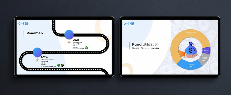
Roadmap: Showed growth direction with clarity
Fund utilization: Answered how capital would be deployed
This ensured that the deck communicated effectively even before design enhancements.
Once the narrative was finalized, we developed a visual direction that balanced creativity with structure.
Key design decisions included:
A soft, modern color palette with gradients to add depth
Illustration-led visuals to maintain a friendly and approachable tone
Clean layouts with consistent spacing to improve readability
Supporting visual elements such as icons and shapes to guide attention
For example:
The business model slide uses color coding and hierarchy to make comparisons quick and clear
The roadmap slide uses a flowing path to visually represent progression
The fund utilization slide simplifies financial allocation through a clean visual chart
The design stays engaging without compromising clarity.

As a pitch deck design agency, we do not take direct credit for a startup’s success.
Funding outcomes depend on multiple factors beyond the deck.
However, Mo’s startup went on to secure its intended funding.
What we can confidently say is that the deck supported the process. It presented the business clearly, maintained investor attention, and balanced personality with professionalism.
Frequently Asked Questions About Duolingo-Style Pitch Deck
1. What kind of startups is the Duolingo style best suited for?
This approach works best for consumer-facing, edtech, SaaS, and early-stage startups that want to feel approachable without losing clarity. That said, we don’t limit ourselves to one style. We design pitch decks across different visual directions based on your audience and goals, not trends. You can explore more of these approaches in our other case studies.
2. Do you follow a fixed template or design everything from scratch?
Everything is built from scratch. We don’t rely on templates because your story, product, and positioning are unique, and your deck should reflect that. Templates tend to force your narrative into a pre-made structure, which often leads to generic, forgettable presentations.
Instead, we build the storyline, slide flow, and visual direction around your business, so every slide feels intentional, aligned, and designed to support your specific fundraising goals.
3. How involved do I need to be during the process?
You’ll be involved at key checkpoints, especially during the content and direction stages, where your input matters most. We align on the narrative, structure, and visual direction early so everything moves with clarity. Beyond that, we take over execution, handling the heavy lifting across writing, design, and iteration, so you’re not stuck in endless back-and-forth and can stay focused on running your business.
4. Can you align the pitch deck with my existing brand guidelines?
Yes. If you have brand guidelines, we work within them. And if your current brand doesn’t include Duolingo-style illustrations or a playful visual layer, we create those as part of the process while still staying true to your core identity. If you don’t have guidelines at all, we define a visual direction that can later evolve into a consistent brand system.
Why Hire Us to Create a Duolingo-Inspired Pitch Deck That’s Built for You?
If you’re reading this, you’re probably trying to build a pitch deck right now. You could model it after something like Duolingo and do it yourself. But the reality is, that usually leads to guesswork, endless iterations, and a deck that looks decent but doesn’t quite land. We’ve spent years building high-stakes presentations where every slide has a purpose, from narrative to design. Let us handle the deck, so you can focus on building your business and closing the round.

How to Get Started?
If you want to hire us for your presentation design project, the process is extremely easy.
Just click on the "Start a Project" button on our website, calculate the price, make payment, and we'll take it from there.